Headless Browser Viewport and Device Emulation for Responsive Testing
Headless browsers strip rendering overhead.
A headless browser is the same browser engine, Chromium, WebKit, or Gecko, minus the window. Nothing about the rendering pipeline changes except the final step of painting pixels to a screen. HTML still gets parsed, CSS still gets applied, JavaScript still runs, the DOM still builds itself the same way it would in a visible tab. Skip the paint step and you get something that runs faster and cheaper without lying to you about how the page behaves.
The operational flow looks like this: a browser instance spins up with a headless flag set, an automation script talks to it over the W3C WebDriver protocol or, for Chromium, the Chrome DevTools Protocol (CDP). From there the script can query the DOM, fire JavaScript, simulate clicks and taps, and inspect network traffic, all without a monitor ever lighting up. The test framework checks the resulting DOM state, response codes, console logs, and performance metrics, then reports pass or fail back to whatever CI pipeline kicked things off.
Speed claims float around without much agreement on the exact number, and that's fine, because the real story isn't the multiplier, it's the memory. Headed browser instances consume 300 to 500MB of RAM per instance due to the rendering engine, GPU acceleration, and visual buffers. Headless mode strips that cost out entirely, and that's the actual reason a CI grid can run hundreds of parallel test instances without melting a server rack. A heavy single-page app with dozens of network calls sees a bigger speedup than a static marketing page does, so anyone quoting a single fixed number is skipping the part where page weight changes the math.
For responsive testing, the important detail is that CSS evaluation, media query resolution, and JavaScript layout logic are all real, because the same engine that serves a live user is doing the work. What's missing is a physical screen and a GPU rendering to it, and that gap is exactly what emulation exists to fill. Keep these two ideas separate in your head: headless describes the absence of a window, emulation describes telling that windowless browser to pretend it's an iPhone. Two different levers. The rest of this piece is about how they combine, and where combining them still leaves a hole.
The tool options and what each one brings to viewport work
Playwright is the one to reach for by default in 2025, and the reasoning isn't close. Built by Microsoft, it covers Chromium, Firefox, and WebKit through one API, so a single test script runs against the engines behind Chrome, Edge, Firefox, and Safari without three separate codebases sitting around. It ships with a built-in registry of device descriptors, iPhone 12, iPhone 15, Pixel 5, Pixel 7, Galaxy S20 Ultra, iPad, iPad Pro 11 among them, so emulating a real device is a one-line config swap instead of a hand-assembled bundle of settings. Set a device in the use config block and every test inherits viewport, user agent, device scale factor, mobile flag, and touch support as a matched set. Stack on geolocation, locale, timezone, or color scheme emulation and the profile gets even closer to a real user's environment. Teams keep migrating to it from older Selenium, Cypress, and Puppeteer setups, drawn by its unified cross-browser API and active development.
Puppeteer, maintained by the Chrome DevTools team, has the tightest possible relationship with CDP since it's built by the same people who build the protocol. Viewport control runs through page.setViewport(), where width, height, device scale factor, mobile flag, and touch support all get set manually, one property at a time. There's no built-in device library, so teams that need named device profiles have to assemble those settings themselves. Experimental Firefox support exists, but Chromium is where Puppeteer's strength lives, which is a real constraint for any team that needs WebKit or Safari coverage. It fits JavaScript-heavy teams that want precise, low-level control over Chrome specifically and don't mind writing the glue code themselves.
Selenium is the oldest of the three, supporting headless Chrome and Firefox through straightforward driver options. Its real advantage is language support: Java, Python, JavaScript,.NET bindings all exist, which makes it the default choice at large enterprises running polyglot codebases or shops that already have a Selenium grid humming along in production. Viewport and user-agent configuration are possible but more manual than Playwright, with no device descriptor shortcut built in.
PhantomJS is worth mentioning exactly once, and only to rule it out: development stopped in 2024, it no longer tracks current web standards, and there's no scenario in 2025 or beyond where it's the right pick. Skip it.
The detail that actually decides viewport and emulation work is Playwright's device registry, full stop. Manually correlating viewport width, device scale factor, and user-agent string is the kind of task that looks simple until someone gets one number wrong and the test starts reporting a device that doesn't exist anywhere in the real world. Removing that manual step is the single biggest practical advantage for any team building out responsive coverage, and it's reason enough on its own to pick Playwright over hand-rolling the equivalent in Puppeteer.
How viewport sizing, DPR, and the mobile flags work together
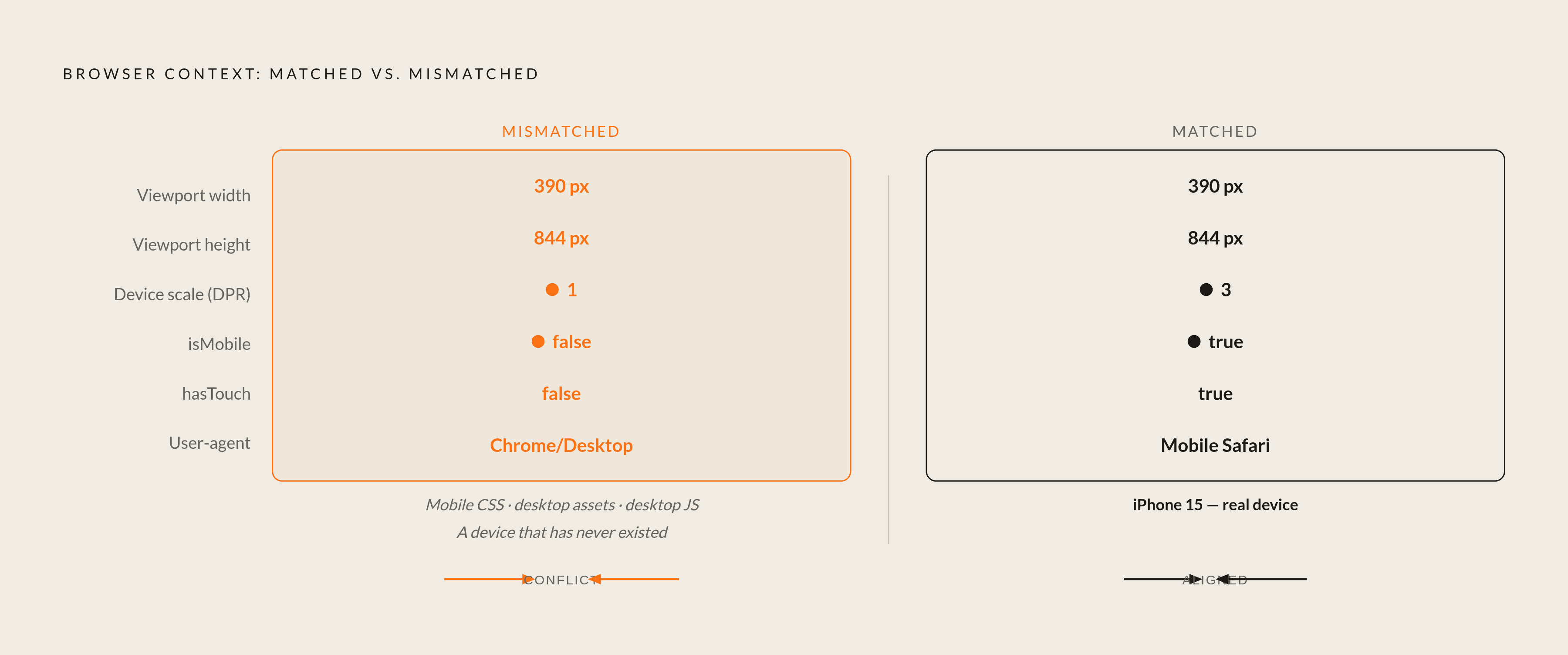
Emulation isn't a toggle. It's a set of properties the browser context exposes to the page, and every one of them needs to agree with the others or the resulting test environment describes a device that has never existed and never will.
Width and height set the viewport dimensions in CSS pixels, and this is the number media queries actually evaluate against. Change this one value alone and different breakpoint rules start firing. Device scale factor, or DPR, is the ratio of physical device pixels to CSS pixels: a Retina display might pack three physical pixels into the space of one CSS pixel, and if DPR isn't set correctly, image tags using srcset or resolution-aware CSS load the wrong asset entirely. isMobile tells the browser to apply mobile-specific viewport handling, including the meta viewport tag and touch event behavior,, which matters for any page that branches its layout logic based on that signal. hasTouch turns on synthetic touch event support, relevant for anything using pointer-type detection or touch-specific listeners. isLandscape flips orientation, useful for catching layout shifts in navigation bars, image grids, or fixed-position elements when a phone gets rotated. And the user-agent string itself gets sent with every HTTP request and exposed through navigator.userAgent, so any site that sniffs UA and serves different markup to mobile visitors needs an accurate string to get a representative response.
Here's the mistake that actually shows up in real test suites: set a viewport of 390 pixels wide, leave DPR at 1, and leave isMobile as false, and the test has built a device that fires mobile breakpoints in CSS while reporting itself as a desktop browser everywhere else. That's not a real phone, a real tablet, or anything else a person owns. It's a hybrid state that exists nowhere outside the test environment, and it's the exact kind of false confidence that makes emulation dangerous when nobody's checking the settings agree with each other. The layout test passes because the breakpoint fired, sure. Meanwhile the page is quietly serving desktop image assets and running desktop JavaScript branches the whole time, and nobody notices until a real user does.
Playwright's device descriptors sidestep this by bundling every property into one named profile. Write devices['iPhone 15'] and viewport, user agent, DPR, mobile flag, and touch support all land together as a coherent set. Puppeteer takes the opposite approach: page.setViewport() sets dimensions and DPR, while user-agent and other properties require separate configuration calls, which hands teams more granular control at the cost of more places for a mismatch to sneak in. That manual approach earns its keep when building a profile for something the built-in registries don't cover, an enterprise tablet with an odd DPR, say, or whatever unusual device a specific client happens to standardize on. In those cases somebody on the team actually needs to understand what each parameter controls, because there's no named shortcut waiting to bail them out.
Which viewport widths to test and how to choose them
"Test at 320, 768, and 1024" was the standard advice for years, and it's aging out badly. Chasing a fixed list of device widths misses the point: the real question is where your own CSS actually breaks, not where three popular phones happened to sit five years ago.
Device market share data still gives a rough map of where traffic clusters, and it's worth knowing. 360 pixels is among the most prevalent mobile viewport widths. 768 pixels covers tablets in portrait. On desktop, the range from 1366 to 1920 pixels covers more than 80% of the desktop market share, according to exemplifi.io. Broken into bands: 320 to 480 pixels for phones in portrait, 481 to 768 for tablets in portrait and small laptops, 769 to 1024 for tablets in landscape and smaller laptops, 1025 and up for large desktop displays.
But a device list only tells you where people are, not where the layout falls apart. Pull the breakpoints straight out of the CSS instead of guessing from a device chart, then test one viewport width just below each breakpoint and one just above it, because that boundary zone is where regressions actually cluster. Boundary conditions are where things fall apart, almost by definition. They're the edge cases where two sets of styling rules fight over the same few pixels, and a device-list approach can sail right past that fight without ever landing a test inside it. Mobile-first stays the sensible default given where traffic concentrates: a desktop-only regression is annoying, but a mobile regression touches the majority of visitors walking in the door.
DPR adds a second axis on top of width that's easy to forget about entirely. A 390-pixel viewport at DPR 3, matching an iPhone 15, exercises a completely different image-loading path than the same 390 pixels at DPR 1. If the application uses resolution-aware images anywhere, and most modern sites do, both DPR values need a place in the test matrix, not just the width.
Network and CPU throttling alongside device emulation
Both Playwright and Puppeteer expose throttling through CDP. Puppeteer offers page.emulateCPUThrottling() alongside network condition presets like Fast 3G, reachable through a CDP session via client.send("Network.enable"). Playwright supports the same category of CDP-based throttling for approximating slower conditions.
Why bother? Because layout bugs that only show up under bad network conditions are invisible on a fast connection, which happens to be the exact condition most engineers test under from office wifi. An element that renders fine when everything loads in under a second might collapse, overlap, or sit unstyled for a beat when the connection is slow. JavaScript-driven layout is especially exposed here: frameworks that build the DOM after the initial paint can produce a flash of broken, unstyled content on a slow connection, because the CSS applies before the JavaScript has a chance to fire. A test running on a fast connection never catches that. It doesn't have time to happen.
Worth being honest about the limit here. Desktop CPU and GPU hardware don't match the timing or the jank profile of a real low-end Android phone, and the documentation for these tools says as much. CDP-based throttling gives a rough approximation of slow-network, slow-CPU conditions. It is not a faithful stand-in for a mid-range Snapdragon chip actually struggling under load, and treating it like one is a mistake. Use it to catch a category of timing-dependent failure, not as a performance benchmark to compare against real device specs, because those two use cases call for very different levels of confidence.
Pairing throttling with a specific named device profile also produces a far more useful test than throttling alone. "Galaxy S20 Ultra under Fast 3G" describes a scenario a real support ticket might reference. "360 pixels wide with 4x CPU throttle" describes a data point that's hard to map back to anything a human being actually experiences.
What emulation cannot reproduce and where the coverage gap lives
This limitation is worth taking at face value: emulation reproduces what a mobile browser exposes to a page, the viewport, the pixel density, touch support, the user-agent string, but the rendering engine doing the work underneath is the desktop build shipped with Playwright, not the actual mobile build of Safari or Chrome running on a phone.
That gap has specific, nameable edges, and it's worth naming them rather than waving at "limitations" in the abstract. Rendering engine version mismatches mean any CSS or JavaScript quirk tied to a particular mobile browser release simply won't show up, because emulated WebKit is desktop WebKit wearing a mobile viewport as a costume. Hardware and sensors don't exist at all in emulation: no camera, no accelerometer, no gyroscope, no biometric authentication, and WebGL and GPU-dependent features reflect the host machine rather than mobile hardware, which matters a great deal for canvas-heavy or sensor-driven interfaces. Hardware-decoded video and DRM systems like Widevine or FairPlay behave differently under emulation or don't work at all. Touch fidelity covers the API surface, meaning synthetic touch events fire correctly, but OS-level gesture recognizers, momentum scrolling physics, and pull-to-refresh don't come along for the ride, so a swipe carousel that passes every emulated test might still stutter or misfire in someone's actual hand. And mobile-specific meta viewport handling can behave differently on a desktop engine than it does on the real mobile browser it's supposed to be standing in for.
Smaller discrepancies pile up too, past the headline gaps: viewport differences that trigger breakpoints in ways nobody quite expected, timing differences in headless execution that expose race conditions a headed browser happens to paper over, screenshot comparisons that don't quite match between headless and headed rendering of the identical page.
None of that is an argument against emulation. It's a map of exactly where emulation should hand off to testing on a real device, and knowing that boundary precisely is what keeps a team from trusting a green checkmark in the wrong situation. Emulation is genuinely reliable for layout breakpoints, media query behavior, asset resolution branching, and basic touch registration. It's unreliable for native gesture behavior, hardware API quirks, and anything tied to a specific mobile engine version. Figure out which bucket a given bug lives in before deciding which tool should be catching it.
Structuring emulation into a test workflow that catches what functional tests miss
None of this matters if it lives as a one-off script somebody runs before a big release. The tools described above only close the gap between functional coverage and visual coverage when they're wired into the pipeline as a standing check, not an occasional favor somebody remembers to run.
A sensible structure starts with the breakpoints pulled directly from the codebase, tested at the boundary points just above and below each one, using device descriptors where a real device is genuinely relevant (Playwright's built-in registry earns its keep here) and hand-built profiles where it isn't. Layer network and CPU throttling on top of specific device scenarios rather than running it in isolation, since a throttled Galaxy S20 Ultra test tells a more coherent story than a throttled but otherwise generic viewport does. Run all of it in headless mode inside CI, because the memory savings and speed gains are exactly what make it feasible to run this matrix on every pull request instead of once a quarter.
Then budget for real-device testing specifically where the documentation says emulation falls short, and this is the step teams skip most often: gesture-heavy interfaces, anything using WebGL or canvas, video playback, DRM-gated content. Emulation handles the breakpoint and layout side of the equation at a scale no manual QA process could match. Real devices catch the rest, and skipping that second layer because the emulated suite is green is exactly how a swipe carousel that works in CI ships broken to an actual phone. Treating those two layers as complementary, rather than assuming one can substitute for the other, is what closes the gap between a test suite that only checks whether a button works and one that catches what a customer would actually notice first.